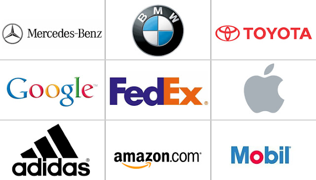
Apple – Amazon – CocaCola – Adidas – BMW – Toyota – Huyndai, etc.
We see these famous techs brand everywhere but never considered what their Logos mean exactly. Bring in the question of Hidden meanings in these logos.
Curious to know? Then check out famous tech company logos with hidden meanings you’ve never even noticed.
 |
| Source – Beingguru |
Apple – Amazon – CocaCola – Adidas – BMW – Toyota – Hyundai, etc.
We see these famous best tech company logos everywhere but never considered what their Logos mean exactly. But every line, curve, colour, context and shape angle accurately has meanings and reasons behind them.
Most of them largely designed to educate something much more than simple building or famous cities and landmarks. Safe to say the meaning in this logos is quite mind sapping or probably weird altogether.
Curious to know? Then check out famous tech company logos with hidden meanings you’ve never even noticed.
Hyundai
Many people consider the South Korean company’s logo to represent the first letter of its name, “H”. How unfortunate you are with your guess.
| Quite thoughtful of them! |
Simply, the letter symbolizes two people if you take a closer look – a client and a
representative of the company shaking hands perhaps after a well-done business deal. Just check the two images above to confirm. Quite thoughtful, isn’t it?
Adidas
The current logo is three stripes and an angle which joined together forms a triangle. This, in turn, symbolizes a mountain which represents challenges sportsmen have to overcome day after day.
The weirdest logo with hidden meaning ever. The designer who designed the famous apple company logo explained the idea behind his innovation in one of his interviews.
He bought a bag of apples, placed them in a bowl and spent time drawing them for a week while trying to break it down into something simple.
| Any Major Difference |
Taking a bite out of one of the apples proved the trick. Completely by coincidence, he realized that BITE sounded exactly like the computer term BYTE. Isn’t this guy a genius!
Read Also ⧭ What Technology will do for us in the next Decade
A famous car tyre producer has a logo in which the first two letters – Ćo depict the wheel of a car – just like your own car. Quite simple!
Formula 1
Sports companies like Nike, Puma, etc can brag about the wealth and the service they may provide openly but mind you, they may also be telling you a very different hidden message in their sports logos.
If you take a careful look at the white space in the Formula 1 logo between the letter – F and the red stripes, you can see the number 1.
The red stripe also is a graphical tech representation of the high speed of formula 1 cars.
On Pinterest, people collect images the like all over the world from across the internet and pin them to their online boards.
That’s why the image of a pin is been hidden in a letter P – simple and clear.
Beats
Now, this is ours. A very much tech equipment used by all termed – headphones. Beats is an audio device producer based in the USA, uses the logo in which the letter B looks like headphones on a person’s head.
That should definitely mean more.
BMW
They say that the central part of the logo symbolizes the rotating blades of an aeroplane which is linked to the company’s early history of aviation technologies.
In fact, it is simply a part of the Bavarian flag. Bavaria is an area in Germany from which the company originated.
Read Also ⧭ Auto-Play feature in search results, a huge Possibility?
LG – Life Is Good
The South Korea Company continues to be a stronghold in the electronics technology market.
The logo of LG represents a stylized image of a person’s face. According to the company represents their aspiration to have ordinary human relations with their customers.
Coca-Cola
In the Coca-Cola logo, the space between the letter O & L, one can clearly see the colour of the Danish flag – purely a coincidence?
Anyways, the big mineral company has used this as a part of its marketing campaigns in the Scandinavian country.
So, that was it.
Thanks for reading up till now. Quite surprised to notice these b company logo meanings? Sadly, the Big G – Google is not on the list.
Feel free to share and don’t forget to let us know about the ones we missed though.

Great Insight Bro. really love it.
Hy,
Glad to have you around Sir. We hope to share more of these too, feel free to shate with friends
Wow. Thanks For Sharing.
Never Knew Any Of These.
But Am Still Curious Though. What Does Google Logo Mean?
Well, you just got to know them now. From my understanding, I got to know that Google Logo which has different colors represents the different companies under Alphabet – now Google's parent company. Thanks for having you around once again.
Seriously, i didn't know any of these. Thanks.
Great info
It was a brilliant opportunity to visit this sort of site and I am cheerful to know, much obliged to you such a great amount for allowing us to have this open door.
Logo Design
This comment has been removed by a blog administrator.
Never Knew Any Of These.
Great things starting you. I have understood your matter former to and you are just too wonderful. I really like anything you have developed now, surely like anything you are saw and the way in which you about it. You style it enjoyable and you silent care for to keep it smart.